This year, we’re celebrating 11 years in operation as Lola Interiors! It’s hard to believe – but the cliché is true: time flies when you’re having fun! Everyone loves a little birthday glow up, and brands are no different (especially from my perspective as Lola’s Brand Manager). I’m passionate about the heart behind our business, just as much as the beauty we deliver to our clients each day. And so, I – and the team – felt it was time to refresh our brand and website to more clearly reflect our values and better serve our clients.
Our main rebrand goal was to increase the intentionality in every detail. Just like our client work, there is so much more to our work than aesthetics – it’s a commitment to personalized design and impeccable service we create that feeling of “home” for our clients. So, it’s important to us that our “look” be an extension of that character.
Isaiah 58 says,
“If you get rid of unfair practices,
quit blaming victims,
quit gossiping about other people’s sins,
If you are generous with the hungry
and start giving yourselves to the down-and-out,
Your lives will begin to glow in the darkness,
your shadowed lives will be bathed in sunlight.
I will always show you where to go.
I’ll give you a full life in the emptiest of places—
firm muscles, strong bones.
You’ll be like a well-watered garden,
a gurgling spring that never runs dry.
You’ll use the old rubble of past lives to build anew,
rebuild the foundations from out of your past.
You’ll be known as those who can fix anything,
restore old ruins, rebuild and renovate,
make the community livable again.”
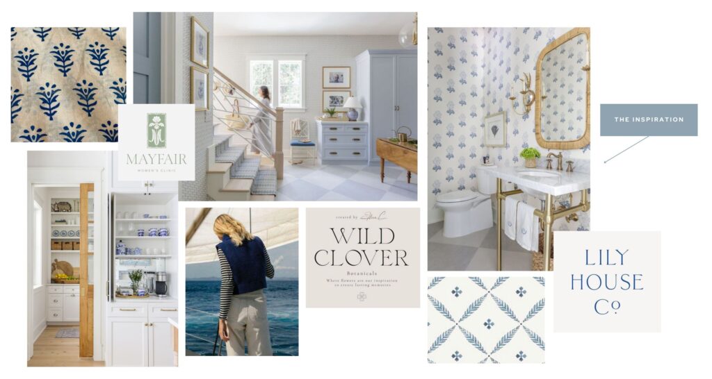
This verse served as confirmation for Tiffany as she prepared to open Lola Interiors over a decade ago – and it served as a guiding verse as we operate today. When engaging with Hello June Creative to update our brand and website (can’t recommend enough!!!), we shared this verse as the guiding light for imagery and symbolism we hoped to incorporate in our new look.
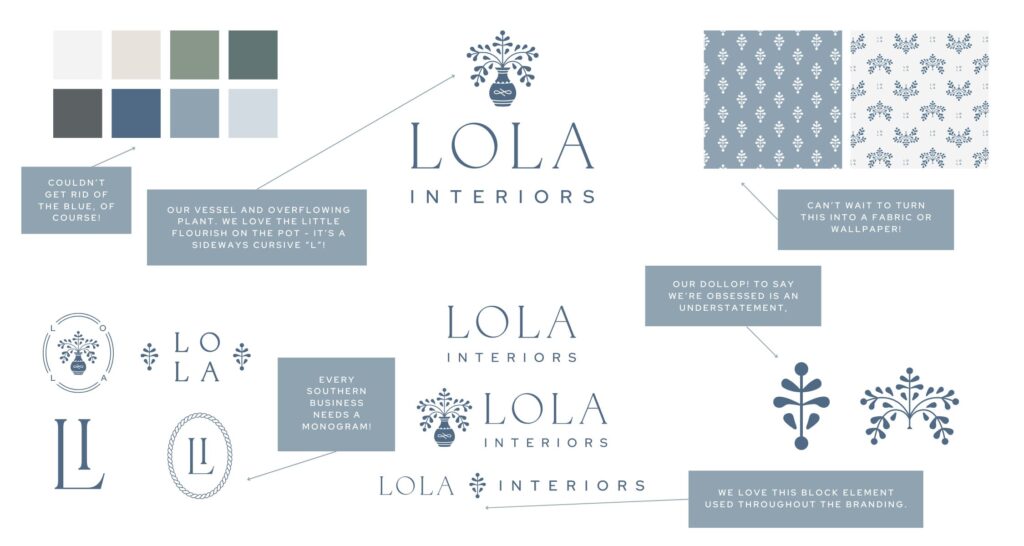
Jen. Nailed. It! Our illustration features a vase and plant that appears to overflow from this vessel. In discussing inspiration – there were many elements of blue and white (shocker), chinoiserie, and block prints. This illustration not only captured that desired aesthetic – but featured a strong vessel and overflowing elements of life and water, symbolic of the well-watered lives referenced in Isaiah.
From there, Hello June incorporated elements of that illustration into primary and secondary logos, patterns, and motifs (like the little mark we lovingly call our “dollop”!) She refreshed our color scheme – still incorporating blue and white, of course, but also adding in green hues and increased saturation. She also presented a package of fonts that are classic, yet current, and most importantly – easier to read. The result is a branding package that nails every goal: intentional, timeless, beautiful, and clear.
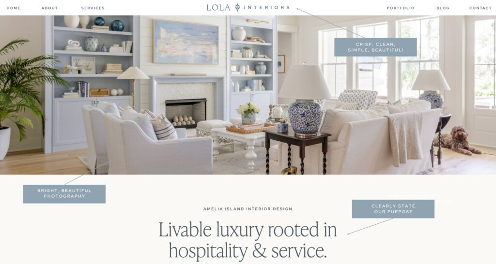
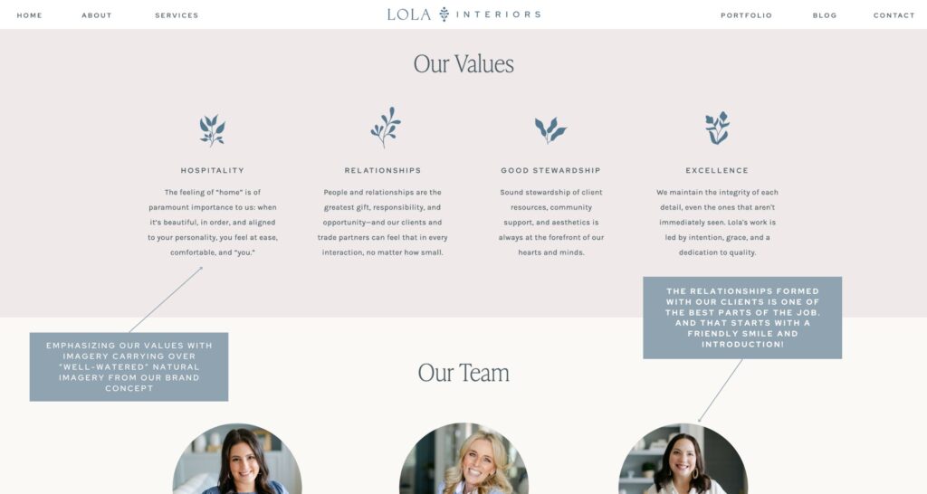
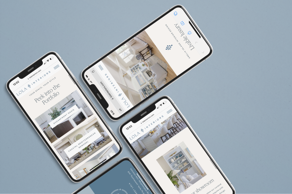
When it came to the website, we wanted to simplify! We loved our previous site, as did many of our clients, but we were craving something a little brighter and lighter – something that would let our work and purpose be the star of the show. Many times, our website is a first impression for clients near and far, so we emphasized easy navigation and beautiful photography of our full service and furnishings interiors design services.
Once again Hello June heard those requests and exceeded our expectations with a site that was not only beautiful, but also clearly communicates our offerings and values. We can’t wait to meet every new client who reaches us through this updated tool.
